Delusion has never been more popular, and media literacy is at an all time low.
Our favorite platforms that tailor content to us deepen our individualism, and the loss of the third space has only worsened the blow. And finally, media literacy is at a shocking low.
Major players amongst Internet spaces – from Google to TikTok – will prioritize profit above all else, leaving collective memory, experience, and knowledge in the bleak foreground. Designed to bring shared knowledge and memory to the forefront, LinkUs is a radically new way to browse the web and the world.
Thanks toZack Hauptman, Alvin Ashiatey, Theo Haggins
Background
Hypertext, hyperlinks & the internet
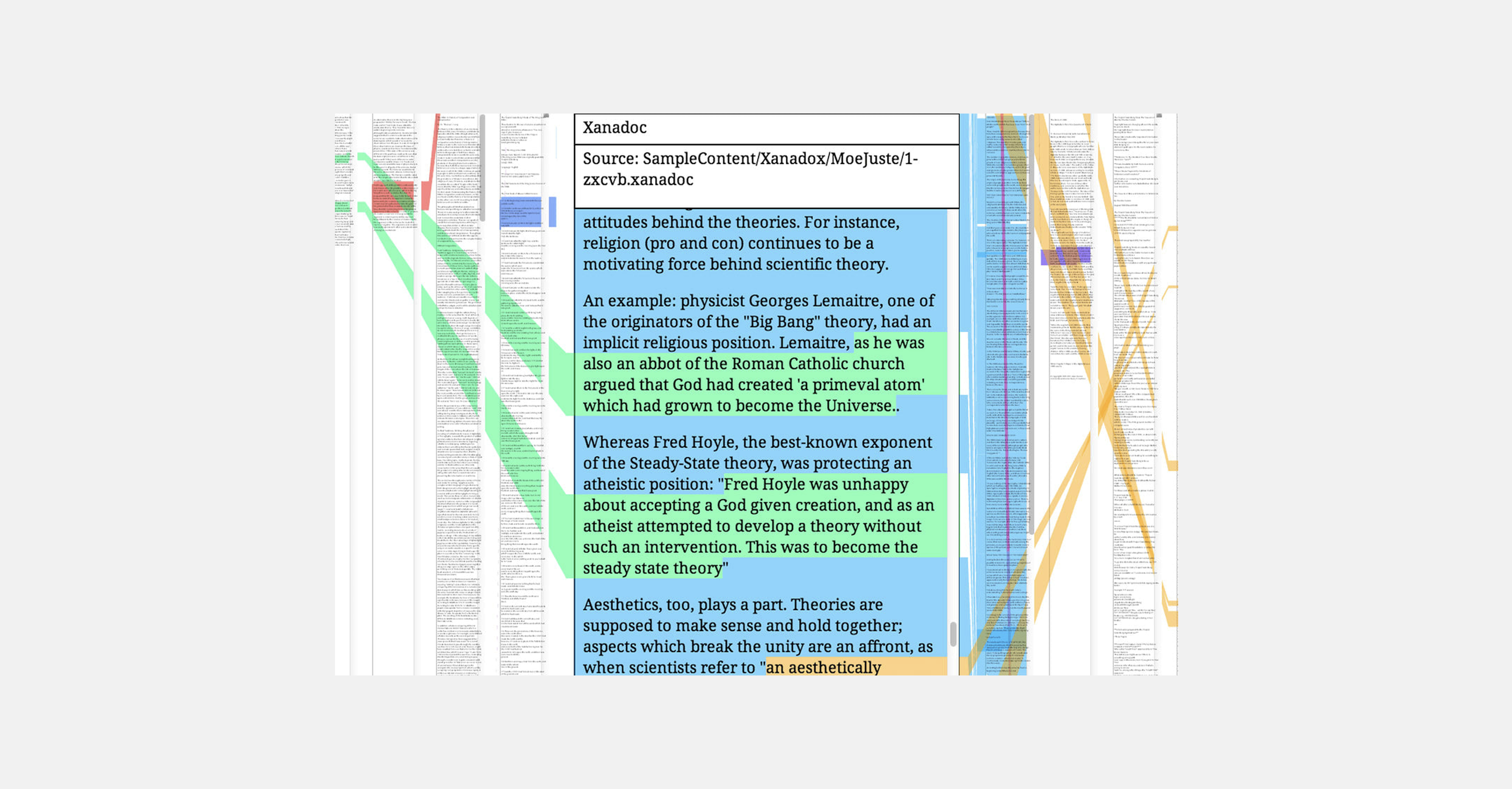
Project Xanadu. In my opinion, this is hypertext as it should be—in a three dimensional space.
On the first day of Alvin Ashiatey’s class called “Interactive Design and the Internet – Software for People,” he showed us a video of the first ever hypertext project. Engineered and designed by Ted Nelson, Xanadu Space took text documents with limiting boundaries and chose to look beyond.
Ted Nelson demos Xanadu Space
00:00 of 00:00
With Xanadu Space, software doesn't just mirror the paper text experience; it enhances it. Parallelism, deep links, and the origin of content all are placed to the forefront.
Appauvrissement & our era of digital delusion
I want to place the central design frameworks of Xanadu Space (parallelism, deep links, origin of content) alongside the current climate of media (il)literacy and individualism.
Especially within the realms of lyrically-dense or content-heavy pieces of media, it is easy to look past certain nuances. At the same time, any somewhat reasonable connection can spread like wildfire (even if grossly inaccurate).
The internet has made us more individualized and less in tune with things that don’t center us. Cyberethnographer Ruby Thelot talks about the concept of appauvrissement, the idea that culture becomes poorer due to the lack of cultivation of the audience.
Now, Ruby was speaking in regards to the "broligarchy" who leaves school ready to sink their teeth into high-paying engineering jobs while having no aesthetic ideals or understanding of art history.
I want to extend his concept into a different realm. Ultra-prevalent products like TikTok and Instagram have tailored our user experiences around content they believe we will like, and we become more deeply rooted as individuals because of it. We firmly believe we are the center of the universe because of the products that tell us so. This is tragic for communities and for us as a collective. It is much harder for people to come to common ground, have empathy, or even enjoy media and art because there is a perpetual craving to be the ideal consumer.
When we also consider how third spaces are vanishing (a project/essay deserving of its own time), it is no surprise that we fail at media literacy and revel in our own ignorances and delusions. The self has become more important than the community – and we all individually & collectively suffer as a result.
How do we become more informed about the media we consume? Even if you don’t think we as consumers share this obligation, I argue that internet discourse and future media & art can only thrive when people routinely educate themselves about what they consume.
Research
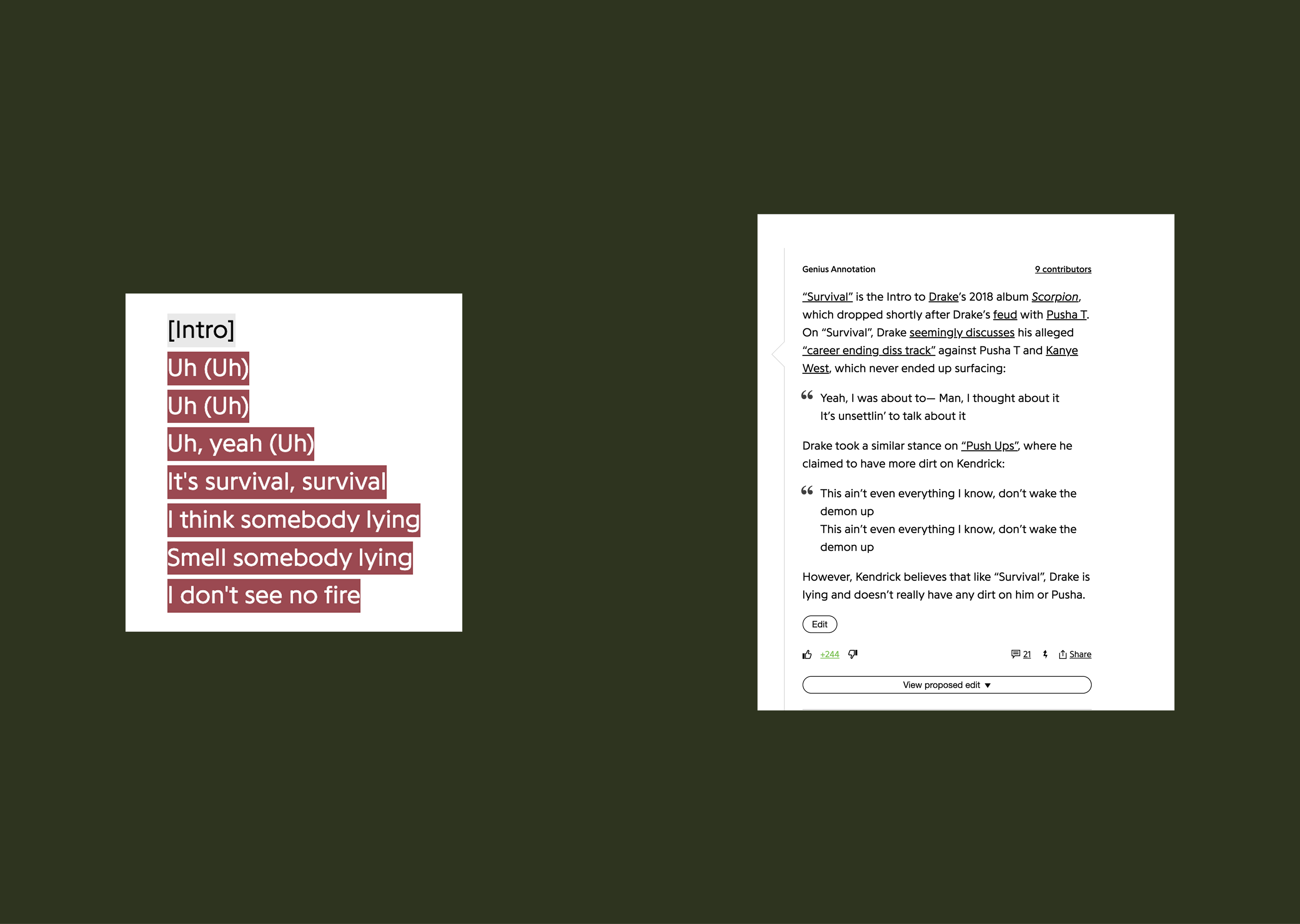
Specific lyrics link to their meanings (text created by members of the community)
Genius Dot Com
One of the most popular media knowledge sites is Genius, where any user can contribute by explaining a song’s lyrics or any detail relevant. It features a link in one direction, with the lyrics tied to an annotation. Any given annotation may link to other songs, artists, or other pieces of media.
Genius does a fantastic job displaying all this information and its users gain so much valuable & collective knowledge from it.
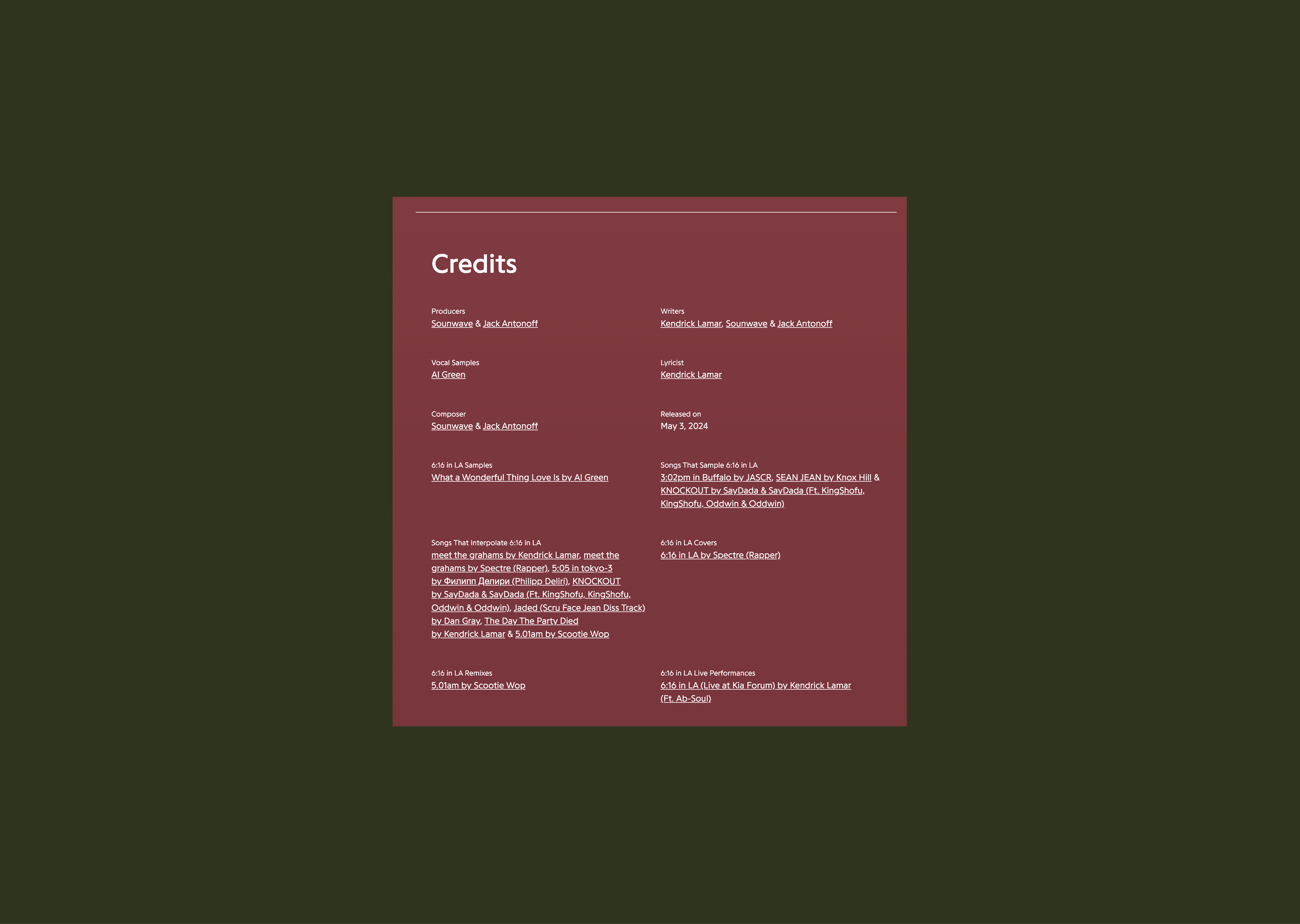
On the bottom of any song's page, there is an extensive list of credits and a index of works linked through interpolation, sampling, etc.
For very curious consumers, Genius provides a way to see how extensive the connections are between two pieces of music (artists, albums, songs, even solitary sounds).
By using Genius's hyperlink system, users can draw insightful connections
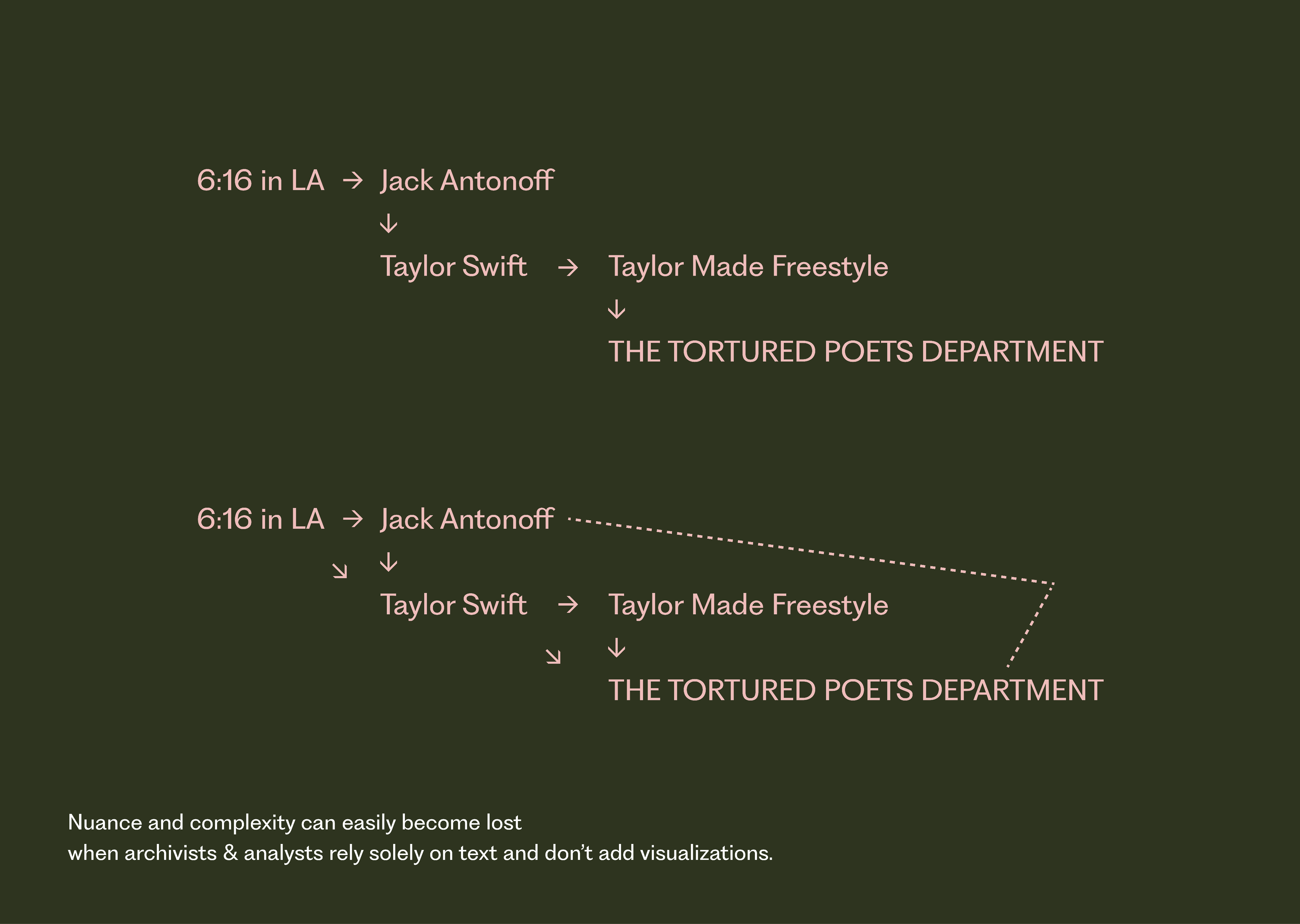
However, it is bound by text and requires so much intention and focus to be an enjoyable experience. How do we add a visual component to increase accessibility and ease of use?
These are both correct assumptions and mental maps of the Genius annotations, but which one gives more insight? Having all analysis and connecting work bound by text leaves the viewer potentially without valuable understanding.
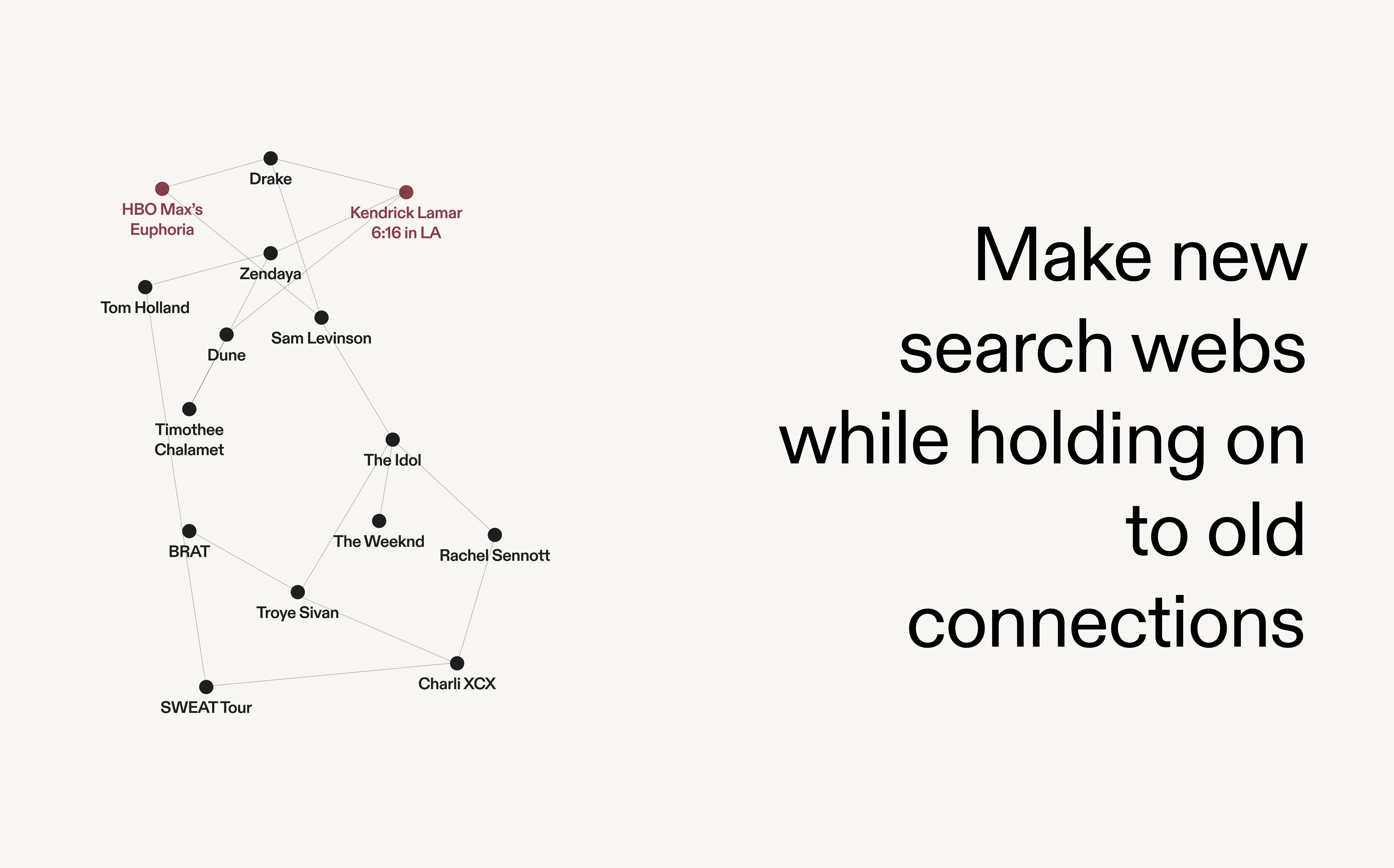
Obsidian
The Obsidian web from afar: the developers made a conscious choice to remove all textual elements when so many nodes are present. However, when you zoom in a little, you begin to see the names of each node.
00:00 of 00:00
The main design inspiration for this intial prototype was Obsidian, my favorite note-taking application. Not simply bound by text, the app employs the frameworks Ted Nelson emphasized. You can use deeplinks that work in multiple directions to form powerful relationships, have texts side by side, and with a visual web, understand where a specific piece of content originates from.
Designs
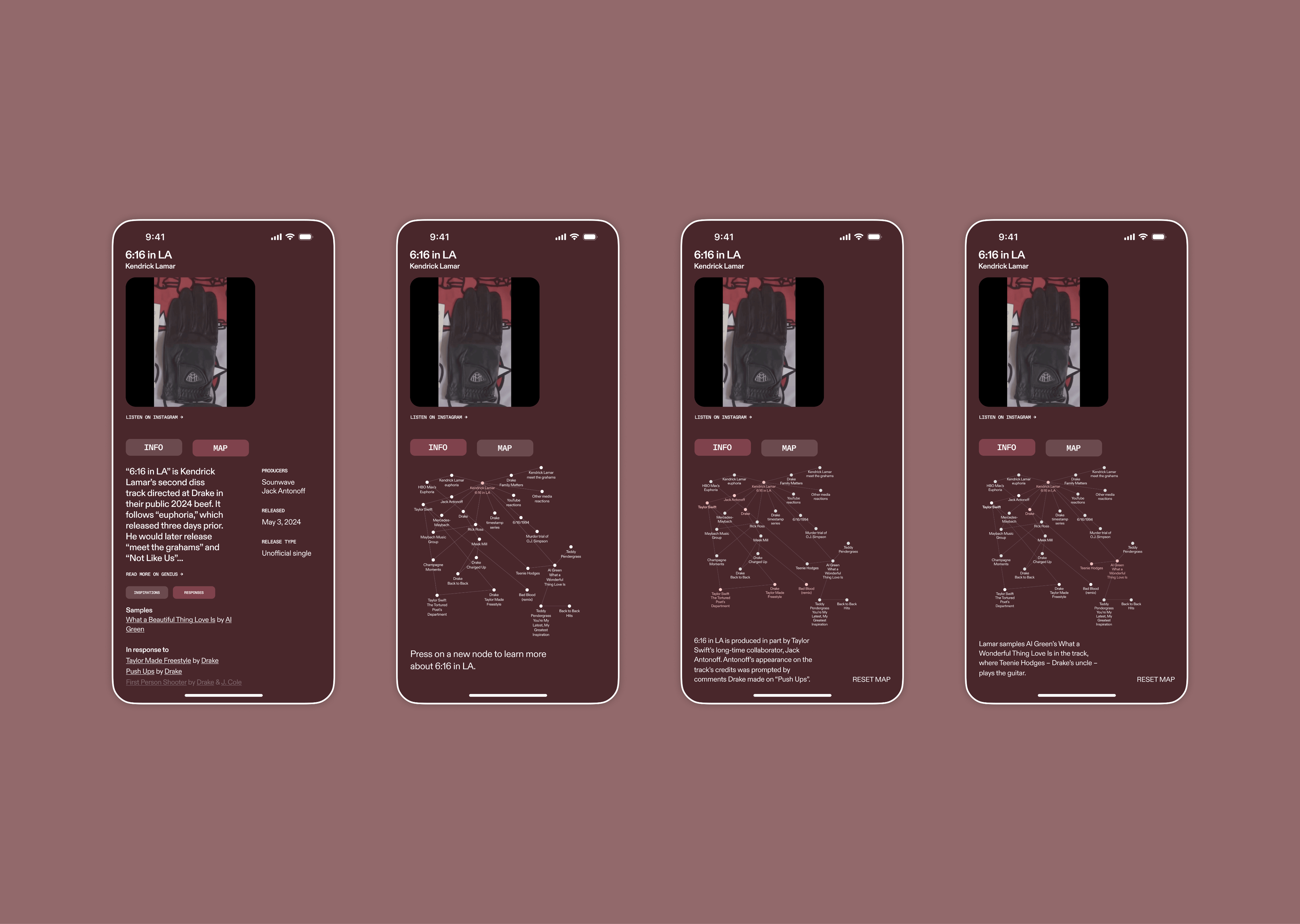
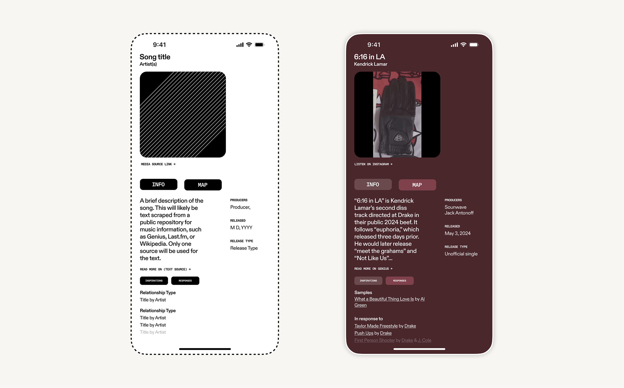
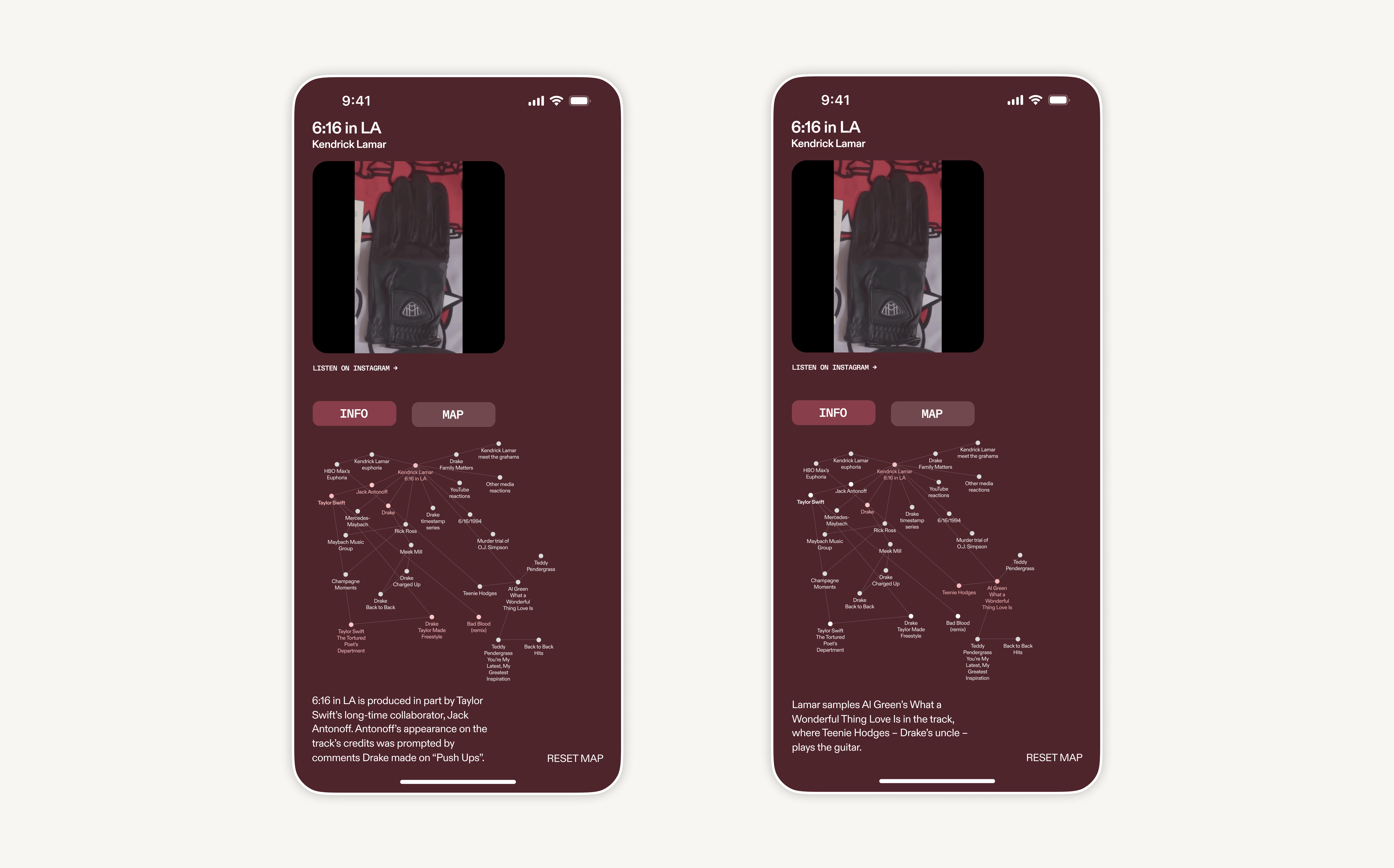
Mockups of LinkUs, developed for Software for People presentation
I adopted a minimalistic UI of a search engine (Google was always in mind) and based the prototypes around two states – textual information and a visual map. Fanatics of Genius may argue that the text-dominant experience is perfect for them – they will find LinkUs to be familiar in this case. But the fundamental addition from the standard search engine is the visual map seen below.
Text-based interface
Map interface in inactive stateMap interface in active state
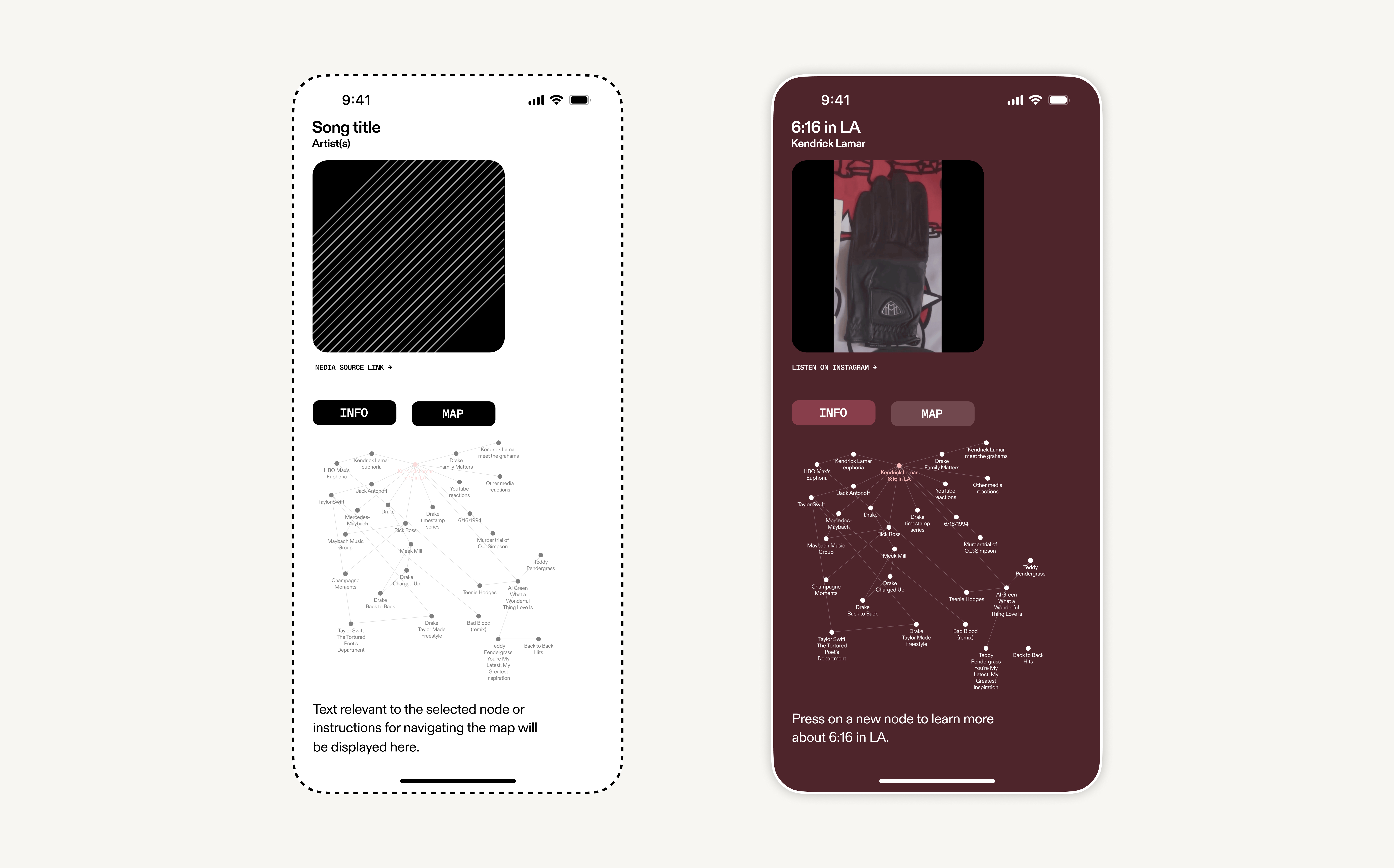
The map – in an Obsidian-like fashion consists of thin lines and circles. Each node is connected to another in some manner. When a user enters the map view for the first time, they see only the searched node highlighted.
By pressing on a sibling node, a brief explanation appears in the bottom left, detailing the various connections between the selected node and original "parent" node.
When users want to dive deeper into a rabbit hole, they can double click on a connected node and see a whole new web. The center shifts, with the once sibling node becoming the parent. The original node will stay preserved and they can always move back at any time.
The map morphs, introducing new nodes while preserving past ones
Reflections
The original idea for LinkUs was a potential feature that Google could add to their search experience. However, as I look into the future for this project, it is hard to see how LinkUs’s ethos could exist alongside Google’s ambitions.
Google's shift towards generative AI in search
Especially when you consider that Google is pushing AI responses into search experience (and establishing it as the default), LinkUs seems out of place. It doesn’t seem like a logical feature to add to Google's experience when they are trying to sell ad space and push ecommerce. That isn’t to say that LinkUs has no viability at all. That could not be farther from true. This clash just suggests that it deserves to be an individual entity, not a browser extension or supplement to any existing web infrastructure.
Donald Judd library
00:00 of 00:00
As I look forward and begin to think about adopting a completely new visual identity for the project, I think about the Donald Judd Library. The website serves as a digital archive but the design is rooted in the layout of the physical library.
How can I keep Nelson's frameworks at the center of my work while improving the visual experience?
Note: This case study was written in 2024, and the project is now serving as a theoretical foundation for my current Yale thesis, Kanon. More on that soon.
Questions/notes for myself
How can users/artists participate in this formation of connections between media? How democratic or paternalistic will the system be?
Where do pieces of heavy (and perhaps too biased) criticism or praise exist within this web/map?
Users will gravitate to the first connection or piece of media they encounter on the site. How do I determine what is pushed to the forefront and what is not?
From Alvin: Look at physical or non-web institutions that serve the same functions/ethos as this project. Maybe your design language will adopt elements from there...
From Cece: How can you bring in the principles and core themes from our Intellectual Property and the Internet class into a version of the site? Can you bring information on copyright, fair use, and legal analysis while keeping the experience as minimal as needed?
Substantiating AI at Kensho & S&P Global
AI-generated financial reports are only useful if users trust what's in them. At Kensho, I designed citation and data attribution systems across two financial products that let users trace every claim and calculation back to its source.