No longer just a collective of university students, Sea12 became a disrupting force in the tech industry, creating powerful, tailor-made automation software.
From April to June, I led a team of 3 designers to design and build their new visual identity and website, cementing their reintroduction to the world.
Sea12's cofounder Charles came to me in late March wanting a new website and brand refresh. While their current identity had some good days, it now was outdated and didn't scream innovative.
They wanted to sit with the best and needed a website and brand highlighting how professional and forward-thinking they are.
We were tasked with creating a brand driven predominantly by the strength of their talents while sprinkling experimental elements to emphasize their drive to think unconventionally.
Strategy
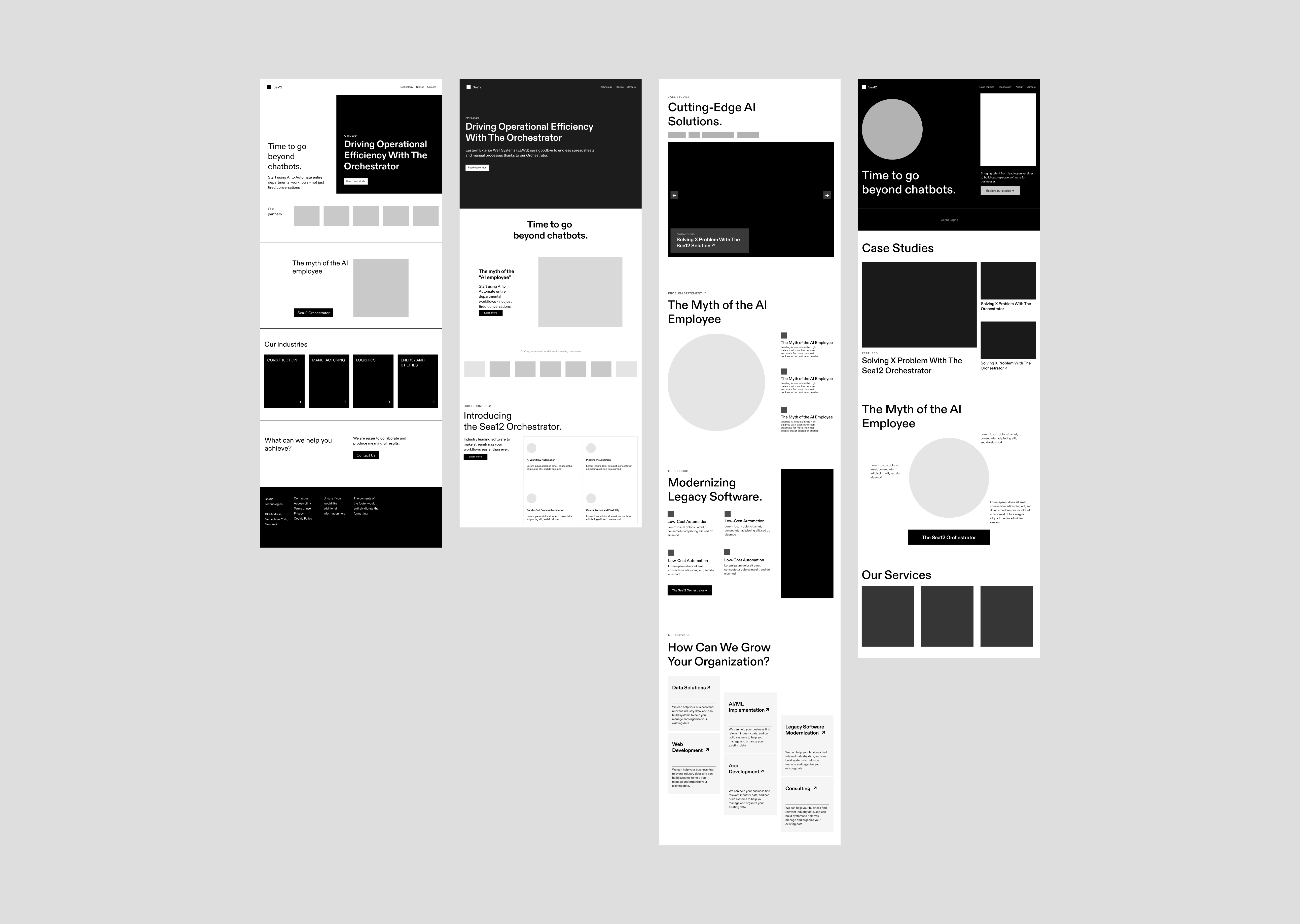
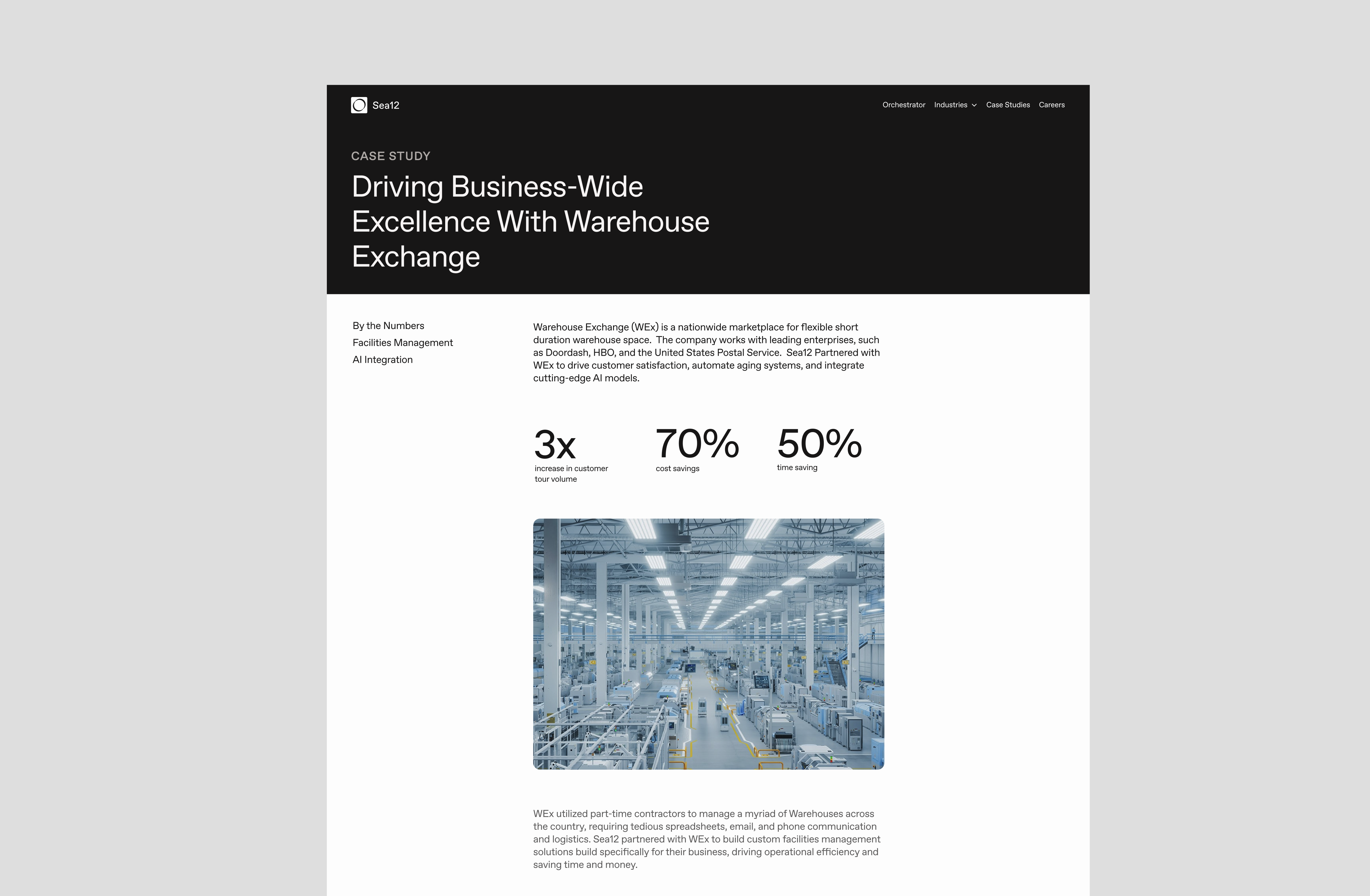
Using IBM as a central piece of inspiration, we started with low-fidelity wireframes with varying structures for the site content. The client enjoyed the side-by-side dynamic that could showcase multiple products or case studies at once, and we went from there.
Low-fidelity wireframes exploring varying layouts
To best understand what direction Charles & the Sea12 team wanted, we (temporarily) ignored many of the rules of design. We chose color combinations that broke accessibility rules, placed visuals on top of text that threatened legibility, and didn't look back.
By doing this we were able to get a sense of what extremes they liked and thus, which ones we could tastefully play with later.
Landing page wireframes, all embracing "jarring design"
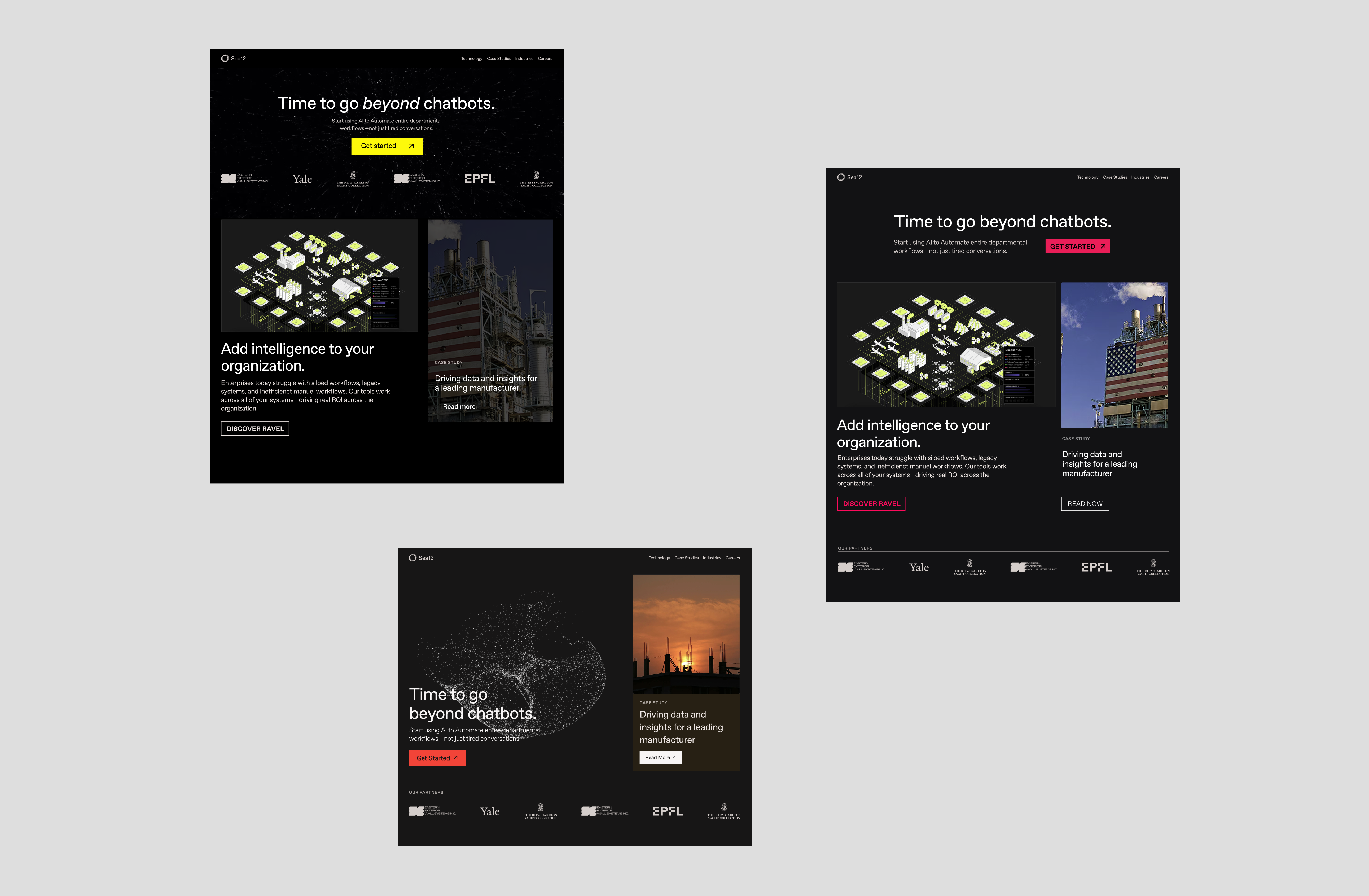
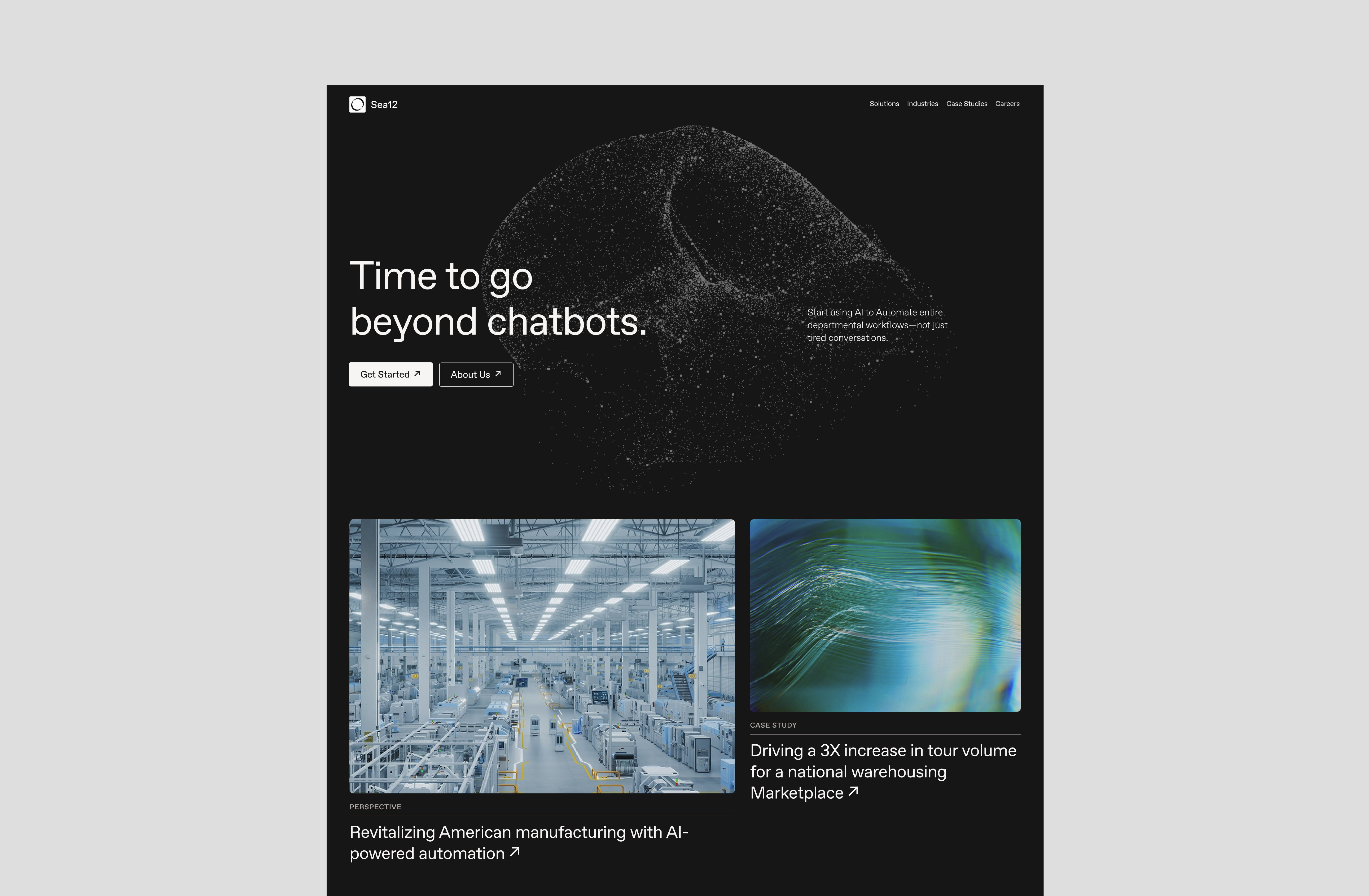
At this stage, Charles also brought up his desire to include a floating particle visual across the brand. We spent this time of experimentation figuring out how it could exist on the site.
Particle by Seth Goldin (Yale ‘25) & optimized for performance by me
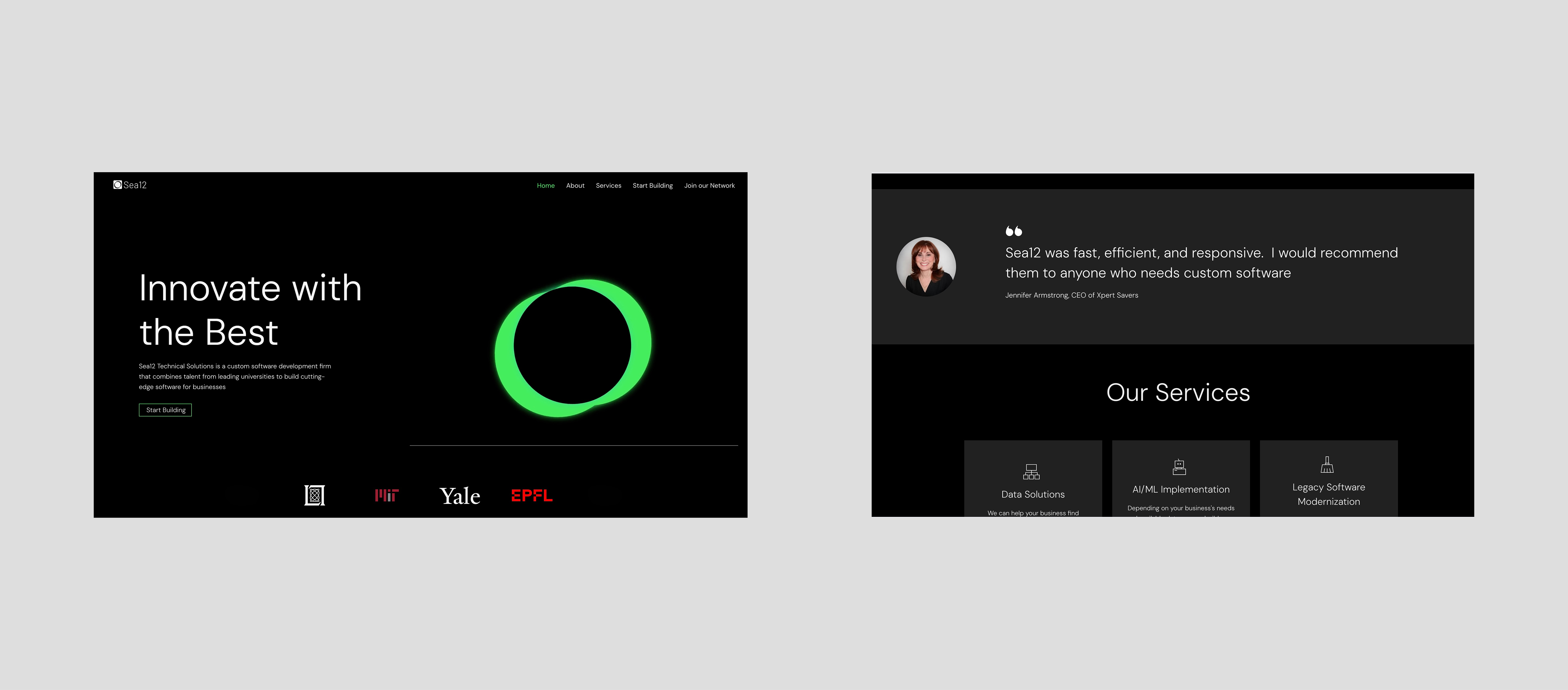
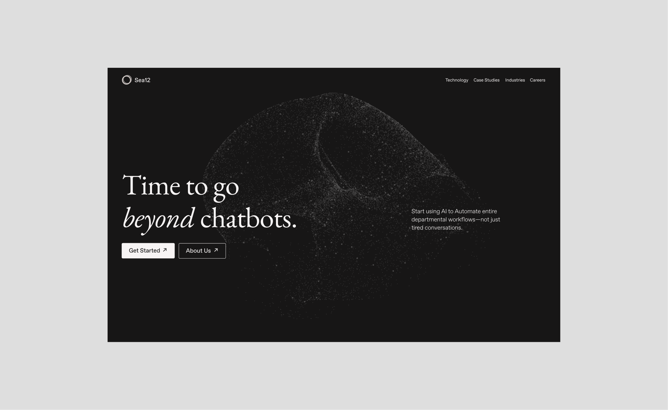
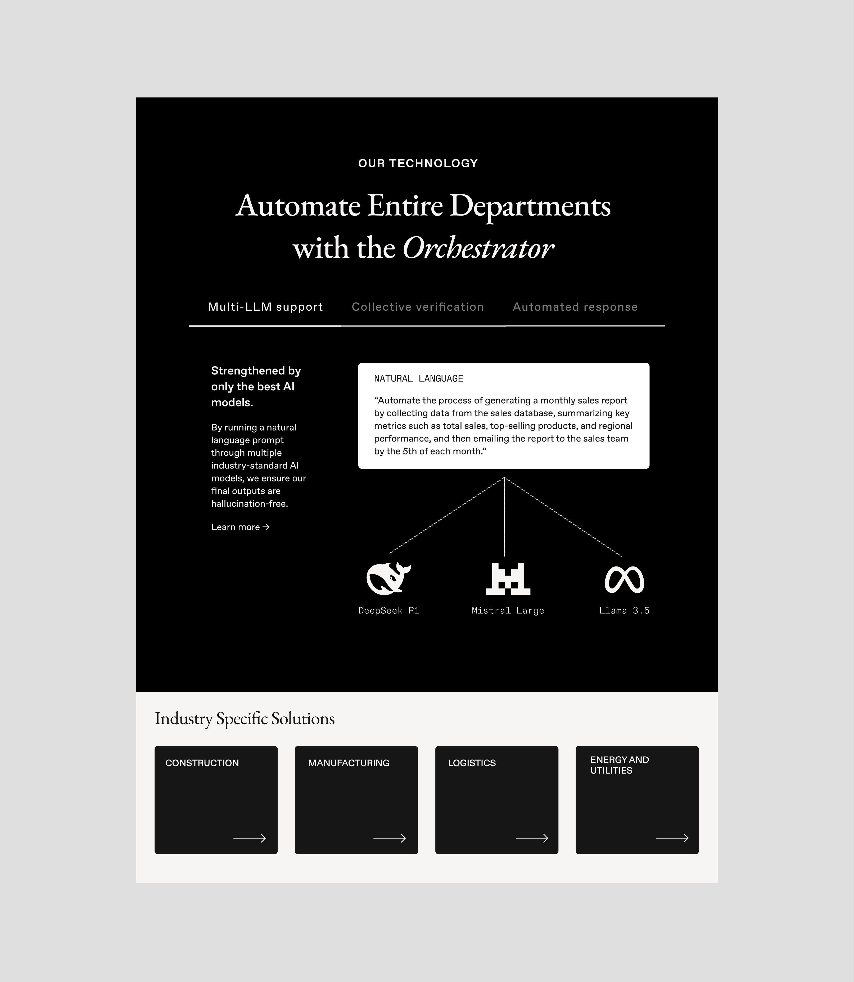
We understood that the particle should play a central role in the user's first impression of the site. To add visual dimensions, we placed the animated graphic in the same space as the text with reduced opacity.
Landing page design featuring particle and serif font
We also proposed using a serif font as the primary Sea12 typeface,
as very few tech companies use serifs and it would emphasize that Sea12 is a disturbing force in the industry.
After a few meetings of pitching, it was clear that the client liked the idea but didn’t love it. We sadly had to leave the concept behind.
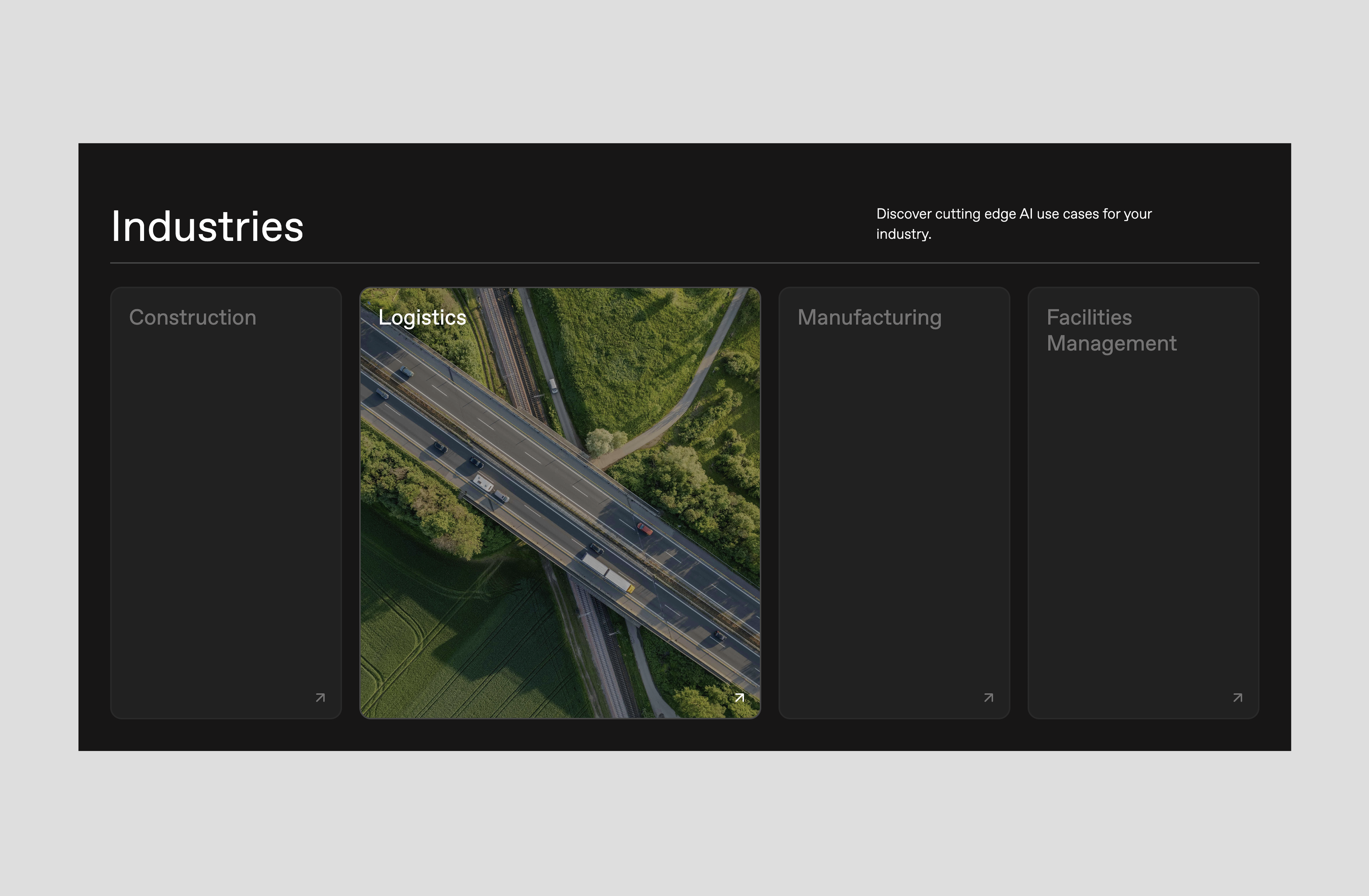
Industries section with hover effects on landing page
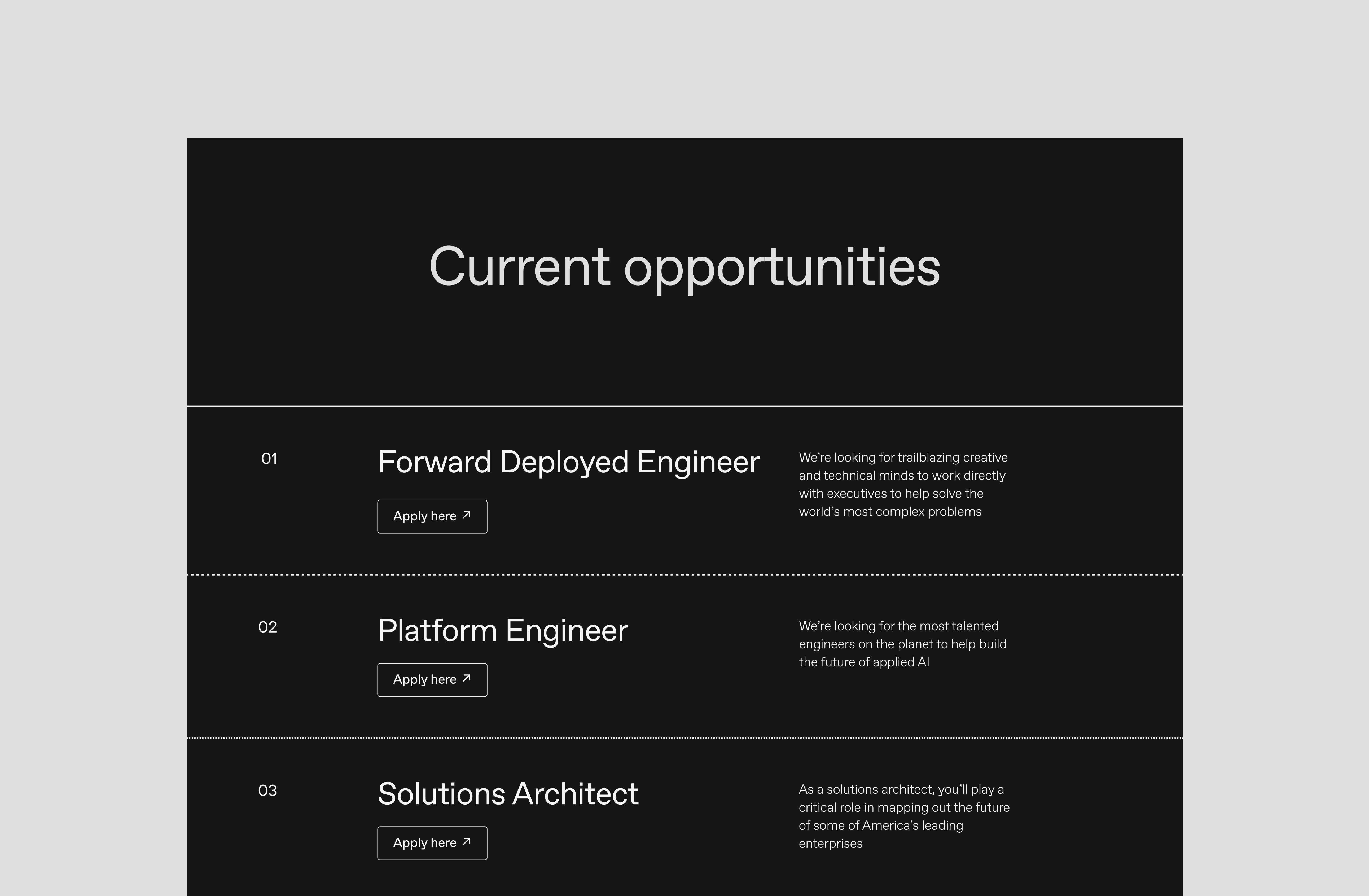
Careers page
Reflections
Launched during their pre-seed round, Sea12's new brand work proved instrumental in securing their multi-million dollar valuation and backing by firms including Caffeinated Capital, Haystack Ventures & SV Angel.
Taking sole ownership of designing several pages, leading most communication with the client and coding 90% of the site was not easy, but it was an incredibly rewarding experience in the end.
Reviving hyperlinks with LinkUs
Delusion has never been more popular, and media literacy is at an all time low.
Our favorite platforms that tailor content to us deepen our individualism, and the loss of the third space has only worsened the blow. And finally, media literacy is at a shocking low.
Major players amongst Internet spaces – from Google to TikTok – will prioritize profit above all else, leaving collective memory, experience, and knowledge in the bleak foreground. Designed to bring shared knowledge and memory to the forefront, LinkUs is a radically new way to browse the web and the world.